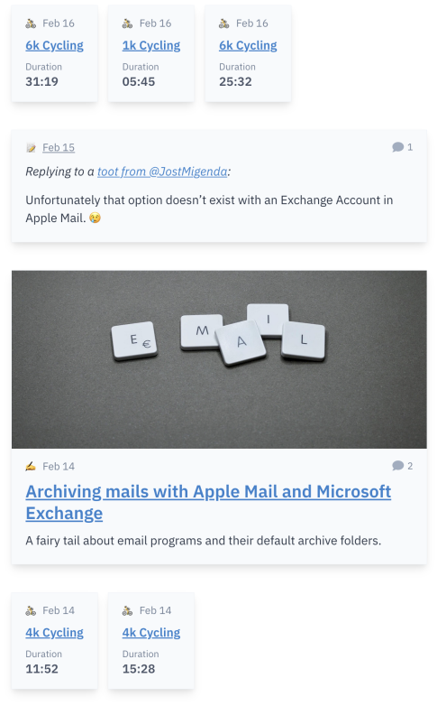
The teasers of different content types on this website (activities, notes, articles and links) have been rendered very similarly in the stream of overview pages, like the homepage.

Especially activites like runs or bike rides do not carry much information, so I decided to make them smaller to account for that.

More improvements:
- Removed current year from dates (instead of “Feb 14 2023” it’s now just “Feb 14”). Content published in years prior to the current one will show the year. Hovering over the date still reveals to whole date string.
- Removed distance and pace on activity teasers. The distance is already implicitely present in the title, e.g. “9k Running” for a run with a distance of 9 km.
- Shortened the duration string to not show hours if it’s not necessary (instead of “0:11:52” for a duration of 11 minutes and 52 seconds it’s now just “11:52”).
- Added proper markup for durations.
- Before: Just the string
11:52. - Now:
timeelement with the appropriatedatetimeattribute for durations (ISO8601) and propertitleandaria-labelattributes for human interaction, e.g.<time datetime="PT0H31M19S" title="31 minutes 19 seconds" aria-label="31 minutes 19 seconds">31:19</time>. Thanks to Terence Eden for his good blog post Making Time More Accessible on this topic.
- Before: Just the string
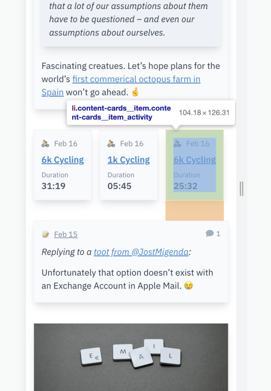
In the course of these minor changes I was also able to use the CSS :has selector for the first time ever. 🙀
.content-cards__item_activity {
  margin-right: 0.75rem;
}

.content-cards__item_activity:has(+ :not(.content-cards__item_activity)) {
  margin-right: 0;
}
The crazy long selector says: “For activity teasers that don’t have a following activity teaser as a sibling, reset the margin-right.”
