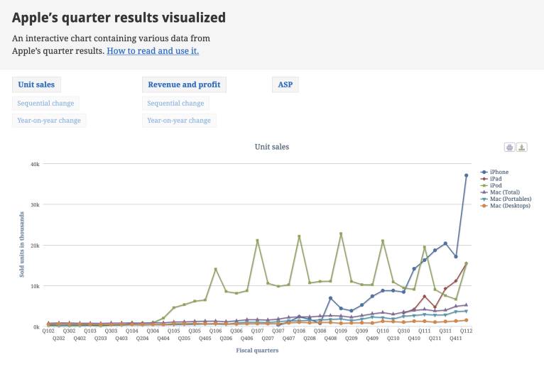
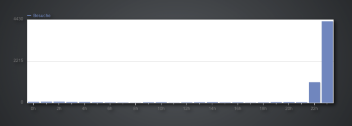
In January 2012 I published the website Bare Figures which enabled you to look at quarterly data of major companies through interactive, easy-to-use charts. In the expiring year 2022, the project has quietly come to an end. The hoster of the website (Uberspace) forced the latest PHP version 8 on all its websites and I didn’t want to invest any time on the necessary CMS updates on a project that had been stalled for a long time already.
Time to look back on this side project and the experiences I made with it.
The start: Apple’s record first quarter 2012 results
Shortly after Apple reported its record first quarter 2012 results I was searching the web for an interactive chart where I could, well, interact with Apple’s financial data in an easy-to-use way. I found … only one. On asymco’s website there was a handy Apple Product Data sheet (link is no longer online, also not retrivable via the Web Archive) and also a way to visualize the data. But there were a few things I didn’t like about the chart:
- it was powered by Flash,
- it was pretty slow when you try to interact with it (see list item #1),
- it only dated back to the year 2006 and
- it could be easier to use and more intuitive.
That’s why I made one myself. Check out the Web Archive link of Januar 29th of 2012 with the first website iteration.

In the beginning I compiled data from 41 quarters – that’s over a decade – in Numbers sheets. Following are a few of the first charts coming out of the data sheet tables. You may find similarities between the charts below and the gazillion charts created by asymco. I guess the reason for this was because they also used Numbers for their charts. Side note: chart images were taken from the Web Archive, higher resolution images are not available unfortunately.


Shortly after the project went public, a few people noticed it.
Gaining traction
I think the first person with reach to tweet about the project was Horace Dediu himself, followed by articles on TechCrunch and PCMag. The first real explosion happened after Daring Fireball mentioned it. This got noticed by other outlets in the Apple community, like Macworld and the German mobileMacs podcast (time stamp 10m10s) a few days later. Throughout the following months and years a few more people wrote about the project, like the Guardian and The Next Web.

Following the media coverage of bigger outlets there were also a lot of blog articles and little mentions here and there from the USA, Germany, France, Italy, Russia, Japan, China, Portugal, etc. The feedback that was most meaningful to me came from a Math teacher who reached out to me on Twitter:
Do you know how awesome your site is for math teachers looking to engage students with real world data?
From manual to semi-automatic
Over the years the website ran through many iterations and enhancements. In the beginning I manually inserted the data into one huge JSON file (not kidding!), in a later iteration ProcessWire and some self-written modules took care of the preparation and processing of the data in a much more sophisticated manner. Right from the start Highcharts has been used for the graphic display and the interaction with the data in the frontend.
The time span from January 2012 to July 2015 was the most intense one. I probably spent up to a thousand hours in my spare time for it. Thanks to the ProcessWire setup I was also able to scale the website in that I could add a lot more companies. Besides Apple I added 8 more: Amazon, BlackBerry, Facebook, Google, Microsoft, Netflix, Tesla and Twitter.
Fading out
The beginning of 2015 marked the last technical iteration of the project. You can read about it in the Web Archive: Reboot 2015. Throughout 2015 I published a few blog posts, especially when introducing new companies, like Twitter, Microsoft or Netflix. This was a fun exercise in trying to comunicate my findings and also to be a more gentle introduction to the project by delivering insights besides the bare numbers of a chart.
Here are some charts I compiled for the last blog post I wrote on the website (from May 25th 2015):


To be honest, looking at the charts I get itchy fingers. I still find it fascinating how charts can communicate interrelationships and correlations.
After 2015 I slowly but steadily lost interest in the project and invested less and less time for it. I had lots of plans in mind for new features, adding way more companies, etc. But some things just end. And that’s a good thing, because this opens up new doors.
Things I learned
- I had a specific need (
I want a chart to interact with Apple’s financial data in an easy-to-use way.
) and I found nothing on the web. I then quickly created a hacky solution (manually inserting data to a big JSON file) – which is almost too embarassing to mention in public – which got the job done. This poor technical solution was the one which originally gained traction by being mentioned by Daring Fireball. This is a good example of getting things out there quickly and not wasting a lot of time perfecting things you don’t even know are worth perfecting. Learn from the experiences and the feedback you will get. After that there is plenty of time to change things or steer technical implementations to a different direction. - Digging through thousands of financial records of company investor relation pages and SEC filings teaches you a lot about what a company actually is all about (follow the money, etc.).
- Especially in the beginning I intensly researched financial numbers and product unit sales of Apple and the Macintosh. Thanks to Google Books I read a lot about financial statistics and reports in magazines going back to 1976, always trying to cross-reference different media outlets to extrapolate numbers for certain fiscal quarters. So in a sense I did a lot of time travels which teached me a few things about how to (re)search for very specific and narrow information.
- There are a lot of insights to gain from interactive charts and visual representations of bare numbers. One of the great storytellers in business in that regard is Horace Dediu who was and is an inspiration to me. Fun fact (and a fanboy moment): I met him personally at SmashingConf 2017 in Barcelona (watch his talk What’s Next? The Future of Mobile in Business, it’s worth your time).
By the way: I exported the data of all charts of all companies and put it in a ZIP file. Do with it what you want. ✌️
