Since I started my IndieWeb journey this month I’ve been thinking a lot about the digital content I’m producing and how I can be more in control of my data, avoiding data silos as much as possible.
The first step towards that goal was to put a system in place where I write and publish content on this website and optionally publish it to other social media outlets, such as Twitter and Mastodon. This content strategy is called POSSE. If a Twitter user answers a tweet that got originally published via my website, I will be notified about it automatically (this is called backfeed), and I can choose to answer the tweet again through my website, which would subsequently create a native Twitter response. Puh, that was a long thought. But you get the gist of it, right? The idea behind all of this is to almost exclusively have as the source of my content this very website. This has some really cool benefits, for example you are being enabled to steer conversations freely from one platform to another, which is pretty mind-blowing when you think about it.
These mechanisms are being powered by Webmentions and Bridgy, and once they are set up (I’m not goin’ to lie to you, it was pretty frustrating at times to get this thing goin’), everything works seamlessly. But the real magic happens if you skip social networks altogether and directly communicate from one Webmention endpoint to another. Ben Werdmüller describes it best:
The effect of independence is practical, not just ideological: if you publish on your own site, your words are much more likely to stand the test of time and still be online years later. Social networks come and go, adjust their policies, etc. And there’s a business value to being able to point to a single space online that holds your body of thought and work.
I see the elegance in this approach and am intrigued by it.
Anyway, excuse me for drifting off, let’s return to the topic of this article:
The system I described above now works for articles I write, for links I post and for notes I want to share. Another stream of data I’m producing since roughly three years now is running data, and I wanted to add that stream to my website as well. So I want to walk you through
- the migration of said data to my website,
- the automatic synchronization of all future runs to my website, and
- the basic data visualization of some running metrics.
Data flow for runs
My data flow for runs looks something likes this:
- I record a run with my Garmin watch and save it at the end.
- The run then gets synchronized to my Garmin account.
- After that I usually edit some metadata like changing the title, adding a note, make the run visible to my connections, etc.
- After the Garmin sync the run gets automatically syndicated to Strava and Runalyze.
- I do this mainly for backup reasons.
- Strava has the additional benefit of acting like a social network for athletes and it is not tied to any specific brands.
- Runalyze is cool because it’s a passionate project by two runners and they present the data in a lot of fascinating ways, e.g. by adding additional interesting metrics like “marathon shape”, “monotony” or “fatigue”.
- Additionally (and this is new), runs now get also uploaded to the ProcessWire instance of this website.
When you look at the data flow you can already see that I can’t follow the same approach as I described in the beginning, meaning I can’t do POSSE: I have to first upload the activity through a proprietary brand with proprietary accessories (the Garmin watch) and only after that initial gateway can I backup the data to systems of my choosing. 🤷♂️
Data export from Garmin
First I needed to export the data of all my Garmin runs. Luckily, you can export every single data point that Garmin has saved about you on the “Export your data” page in your account. Click the button and after a few minutes you get an e-mail with a link to a ZIP file which contains a ton of data.
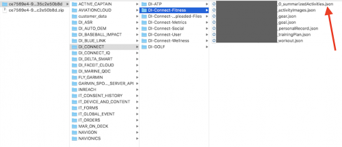
You can find the running activities in the file suffixed with summarizedActivities.json. Here’s a screenshot of where you can find it:
Data format of an activity
The JSON file basically consists of a huge array which contains all activities as JSON objects. An activity contains every data point my Garmin watch tracks for a run and it looks something like this (this is the shortened version, I omitted a lot of fields):
{
  "activityId": 5108786485,
  "name": "Munich Running",
  "activityType": "running",
  "beginTimestamp": 1592491169000,
  "eventTypeId": 9,
  "duration": 4299037.109375,
  "distance": 1200615.0390625,
  "elevationGain": 4900,
  "elevationLoss": 4000,
  "avgSpeed": 0.27929999828338625,
  "maxSpeed": 0.32379999160766604,
  "avgHr": 140,
  "maxHr": 154,
  "maxRunCadence": 89,
  "steps": 6880,
  "calories": 3712.3577199999995,
  "aerobicTrainingEffect": 3.299999952316284,
  "avgVerticalOscillation": 10.130000305175782,
  "avgGroundContactTime": 289,
  "avgStrideLength": 105.98000488281251,
  "vO2MaxValue": 50,
  "avgVerticalRatio": 9.390000343322754,
  "anaerobicTrainingEffect": 0,
  "minTemperature": 23,
  "maxTemperature": 29,
  "minElevation": 51659.99755859375,
  "maxElevation": 53479.998779296875,
  "avgDoubleCadence": 156.328125,
  "maxDoubleCadence": 179,
  "locationName": "Munich",
  "summarizedDiveInfo": {},
  "maxVerticalSpeed": 0.0399993896484375,
  "lapCount": 13,
  "waterEstimated": 865,
  "trainingEffectLabel": "AEROBIC_BASE",
  "activityTrainingLoad": 90.9810791015625,
  "pr": false
}
As I occasionally also record step walks or hikes and those also show up in the activities array, the first step was to filter the array for runs only (the trigger being "activityType": "running").
After that I had to think about which data points are relevant for me. Which metrics do I care about? Which metrics are irrelevant for me? For example the metrics duration, distance, elevationGain and beginTimestamp are pretty important, but things like the estimation of water loss or my user profile ID are not.
For the relevant metrics I then had to understand what the unit value for each metric actually stands for and then find out what calculations to make to transform it into the value unit that I want. For example, the unit for
-
avgVerticalRatio(e.g.9.3900…) is percentage (no transformation needed, just rounding), calories(e.g.3712.3577…) is kilojoules, you have to multiply the value by0.2388to get kilocaloriesduration(e.g.4299037.1093) is milliseconds, you have to multiply the value by1000and round it to get secondsmaxSpeed(e.g.0.3237…) is freakin’ meters per decisecond, you have to multiply the value by36to get kilometers per hourprstands for “personal record” and is just a boolean value,- and so on…
Migration script for ProcessWire
Next up is parsing the JSON, looping through every activity, apply the appropriate data transformations determined in the previous step and save every activity as a page in the ProcessWire backend.
Before that I already established a template hierarchy in ProcessWire: there is a page with the template runs and it has as its children pages with the template run. Every run page contains the fields that get filled up by the appropriate data of the JSON activity.
Here’s roughly what I came up with:
function saveGarminRunsToProcessWire() {
  $parent = pages()->get("template=runs");

  // get the JSON and decode it to a PHP array
  // I can loop through
  $runs = json_decode(file_get_contents('runs.json'));

  foreach ($runs as $run) {
    // check if run already exists
    if (pages()->get("template=run,activity_id={$run->activityId}")->id) return;

    $p = new Page();

    $p->of(false);

    $p->template = 'run';
    $p->parent = $parent;
    // use the timestamp as the page name aka the URL
    // of the page
    $name = date('Y-m-d-H-i-s', $run->beginTimestamp / 1000);
    $p->name = sanitizer()->pageName($name);

    // save the page to have the template
    // fields available
    $p->save();

    // now populate fields

    $p->of(false);

    if ($run->avgSpeed) {
      // transform from meters per deciseconds to kilometers
      // per hour, and round the value (e.g. 10.1 km/h)
      $p->speed_avg = round($run->avgSpeed * 36, 1);
    }

    if ($run->pr == true) {
      // `is_personal_record` is a checkbox field in the ProcessWire
      // backend. Check it, if the JSON value is `true`
      $p->is_personal_record = 1;
    }

    // and so on...

    // save the page at the end
    $p->save();
  }
}
In total I map around 30 fields from a JSON activity to a ProcessWire page.
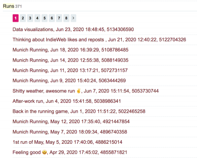
After executing the script, all my Garmin runs where successfully mapped to a ProcessWire page in the backend:
And a single run features all data fields I deemed relevant for my use case:
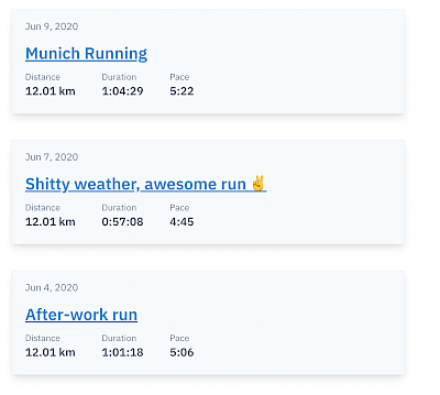
All that was left to do is to present the data somehow in the frontend. The parent page of all runs shows the stream:
And a single run features its data in a simple way:
Syncing new runs
The next big question for me was how to continuously sync new runs to my website. What I needed was a way to use the Garmin API to get the most recent run(s) of my account, and basically execute the exact same function from above with the API response as the input data.
Luckily some great folks already thought long and hard about this and came up with solutions: David Wilcock has written a PHP adapter for interrogating the Garmin Connect API and it fits my needs perfectly (by the way, the documentation of the API functions is superb).
Ok, I have the API to talk to Garmin and get a response of my most recent running activites. What was left to do is to put ProcessWire into the mix and bootstrap the engine into the script. You can use ProcessWire’s API in other PHP apps and shell scripts, and that’s what I did. After changing the signature (and the name) of the “save Garmin JSON run to ProcessWire page” function from above, and installing the dependencies of the php-garmin-connect project with composer install I was ready to go. I came up with this script:
#!/usr/bin/php

<?php

namespace ProcessWire;

// bootstrap ProcessWire engine
include '/path/to/processwire/index.php';
// include function to save from JSON to ProcessWire
include '/path/to/self-written/save-from-json-to-processwire.php';
// include php-garmin-connect project
require_once __DIR__ . '/path/to/php-garmin-connect/vendor/autoload.php';

$credentials = [
  'username' => 'xxx',
  'password' => 'xxx',
];

try {
  $garminConnect = new \dawguk\GarminConnect($credentials);
  // get the 5 most recent running activities
  $runs = $garminConnect->getActivityList(0, 5, 'running');

  foreach ($runs as $run) {
    // the ProcessWire function from above
    saveGarminRunToProcessWirePage($run);
  }
} catch (Exception $objException) {
  // some log statement
}
Now whenever I want to sync Garmin runs to my website, all I have to do is execute the above script through my terminal.
To automate the process I set up a cron job in my Uberspace server to execute the script once every other day:
00 20 */2 * * /location/of/the/script/save-garmin-run-to-processwire.sh
Every time I sync a run to Garmin I can be sure that a day or two later the run will show up automatically on my website as well, and that all data aggregations and visualizations are updated with it (more on that below). 🎉
Bummer: Garmin export !== Garmin API
After the cron job ran (no pun intended) for the first time I got some weird values for a few metrics and some fields where completely empty in the newly created ProcessWire page for the run.
Turns out that the data format of an activity from the Garmin export is not really exactly the same as the response you get directly from the Garmin API. Some keys are named differently (e.g. averageRunningCadenceInStepsPerMinute instead of avgDoubleCadence or averageHR instead of avgHr) and also a few unit values are different (e.g. the unit for speeds is not “meters per decisecond” but the very more sensible “meters per second”, and the unit for calories is not “kilojoules” but “kilocalories”). So I adapted my data transformations accordingly. After deleting the ProcessWire page with the faulty data and manually triggering the script again, everything was fine.
In hindsight it would have made more sense to exclusively use the Garmin API as a means of exporting the running data and do the initial index. Afterwards one is always wiser.
The fun stuff: data aggregation and visualization
The cool thing about hosting data on a platform you have complete control over is that your imagination is the only limiting factor of what you can do with it and how to present the data in a way that you want it to be presented.
I started with two simple additional views on top of the (rather lame) stream of single runs:
- A table summary of a few metrics.
- Charts showcasing specific metrics of the last 100 runs.
You can see the views on the top of the “Runs” page.
Table summary
For the table summary I wanted to add up current weekly, monthly and yearly numbers for metrics like duration and distance. Additionally I showcase the number for the same metric of the corresponding last time period (last week, last month or last year) to get a quick overview of how I’m comparing to past periods.
As the calculations are potentially rather expensive, I hooked into the “saved a page” ProcessWire hook and do the calculations every time a “run” page is being saved in the backend. The values you see in the table are basically just static numbers that get retrieved quickly, the computation for them already happened before you visited the website.
SVG charts
For the charts showcasing metrics of the last 100 runs I opted for simple SVG spark line charts. The spark lines I spotted on Jeremy’s website were the initial motivator for me.
There are cool tools you can use for this, e.g. SVG Sparklines by Kevin Marks. The handling is super easy: include a SVG file, add the data you want to showcase as a query parameter, done. It looks like this: sparkline.svg?2,0,1,1,4,6,9,6,5,0,1,2,5,2. The SVG file has some JavaScript inside that interprets the query parameter and builds the SVG polyline accordingly.
In the end I chose not to use it, because I wanted to not depend upon JavaScript to render such a simple thing as a SVG chart. I do not use any external tool for generating the SVGs, instead I hand-coded it. The important things I wanted to achieve technically:
- No JavaScript needed for showing a basic version of the SVG charts.
- Progressively enhance the visuals with JavaScript by adding color scales to the data set to better distinguish between low and high values.
- Make the charts responsive.
If you visit the “Runs” page with deactivated JavaScript and look at the charts you will see this:
The charts are accessible in that you can get a feeling of the relationship between the single data points. For example the spikes in the “Distance” chart are long runs I did when training for a marathon this year. On the other hand, charts like “Ground contact time” show that there are metrics that do not have much variance between data points.
When you activate JavaScript the charts get progressively enhanced with a neat color scale:
This is powered by chroma.js. You basically give it the minimum and maximum value of a data set and it generates a semantic color scale for every single data point in the set: lighter colors representing low values, darker colors representing high values). Relationships and differences can be spotted much easier and faster now, especially in data sets that don’t have much variance in them like “Ground contact time” or “Avg. vertical oscillation”.
Side note: For different types of color scales the chroma.js Color Palette Helper and ColorBrewer 2.0 were very helpful for me. Chapter 6: Visualizing Geographic Data was crucial for me in understanding how to work with chroma.js.
Moving on, making the charts responsive wasn’t an easy feat. The article setting me in the right thinking spot was “How to Make Charts with SVG” from Robin Rendle. As it is often the case in responsive design, every value you put on the SVG elements must be relative in order for this to work. Here’s a simplified example of the code I’m using:
<svg version='1.1' xmlns='http://www.w3.org/2000/svg'>
  <rect width='50%' height='100%' y='0%' style='transform: translateX(0);'></rect>
  <rect width='50%' height='50%' y='50%' style='transform: translateX(50%);'></rect>
</svg>
Let’s walk through the attributes and how they are being calculated:
width: divide1by the length of the data set, multiply the result by100.height: the firstrecthas the highest value in the data set withheight: 100%. Divide the actual data value (e.g. in the case of speed this would be something like10.1kilometers per hour) by the highest value in the whole data set (also10.1in this case), multiply the result by100. The secondrect’s actual data value is therefore5.05kilometers per hour.y: subtract100by theheightvalue to push therectto the bottom of the SVG canvas area (otherwise the chart would be “up side down”).style: multiplywidthby the index of the data point to order therects side-by-side on the x-axis of the chart.
This mechanism scales beautifully, you could easily have hundreds or thousands of rects in there (not sure if your browser/computer could handle such an amount though 🤭). You can give the wrapping svg element any width or height you want, and the chart elements will expand and contract accordingly.
What’s next?
I want to put more work into the charts, progressively enhancing them even more. I thought about
- linking every single bar to the URL of the run it represents,
- add more info to the user on hover
- show the min. and max. value of each chart by default, accompanied by the unit of the metric,
- show a median trend line for every chart, and
- eventually improving the accessibility of the charts.
Conclusion
This was a wild little ride! I learned a lot along the way:
- The unit meters per deciseconds is the weirdest thing I saw in a long time.
- Writing SVG code by hand is actually a lot of fun.
- I’m always fascinated with visualizing data and I feel I should dig deeper into this area.
- I looove the thought process of starting with something simple and enhancing it step by step by bringing new technologies into the mix. It has definitiely a philosophical dimension to it.
- I noticed that I’m somehow more motivated to go out for a run because I want to make sure that the cron job has something to do when it fires. Is that weird?


