I built a tool which gives you a quick overview of selectors and their specificities across a CSS file in bird’s-eye view. Say hello to the Specificity Visualizer!
It’s a visual approach to identify potentially problematic patterns and especially useful for analyzing big and complex stylesheets.
Before jumping into how the tool functions and what you can get out of it I want to shortly talk about why I built it.
Why I built it
Let’s take a step back: this year I switched jobs twice. Once in July, switching from jambit to Stylight, and once in November, switching from Stylight to censhare. With each switch I was in the position to take a thorough look at big (and heterogeneously grown) stylesheet architectures, making sense out of them, looking for where pain points are, and so on.
This is where specificity graphs come in. I usually use them in these situations because they are a nice little method for getting a quick overview and snapshot across an entire stylesheet. If you know how to interpret and read them, you quickly get a “feeling” of a CSS code base.
Call me a nerd, but thinking about the concept of specificity graphs excites me. I think they
- are intellectually challenging,
- help think about stylesheets in an architectural manner,
- are great for communicating with stakeholders from a non-tech or non-frontend background.
Sadly the tools out there for generating said graphs couldn’t bring that excitement into reality, at least not for me. Don’t get me wrong, the graphs generated by tools like CSS Stats or the CSS Specificity Graph Generator are fantastic and simple to use, but both from a functional point of view (no zooming, no optical distinction between different specificity categories, …) and from a conceptual point of view (specificities are quietly being added up, …) they don’t generate the information I need when analyzing stylesheets in this depth. So I decided to build one on my own.
What are specificity graphs anyway?
If you’ve read this far and don’t have a clue what specificity graphs are all about I encourage to read the article that started it all, The Specificity Graph, by Harry Roberts. Go read it, I’ll wait here for you.
For those of you who are in a rush, the key take-aways from the article for how to read a specificity graph are as follows:
The Specificity Graph works by taking a look at your entire project’s CSS, and plotting the specificity of all of its selectors on a simple line graph. On the
xaxis we plot Location in Stylesheet […] and on theyaxis we plot the specificity of that selector […].
Regarding a potentially “bad” graph:
A graph with a lot of peaks and troughs is a bad Specificity Graph: it is telling us that our CSS is full of—or prone to—specificity issues because of weighty selectors being defined before lighter ones. We have a codebase that is likely to prove problematic because we have erratic and poorly managed specificity-and-source-order: we are more likely to spend time undoing or negating the effects of high specificity CSS that was defined too early in the project.
Regarding a potentially “good” graph:
Ordering CSS based on its specificity leads to much simpler and hassle-free maintenance, as well as offering improved scalability due to more evenly distributed complexity and a more sane working environment. […] Always try to maintain an upward trending Specificity Graph across your projects. It is a helpful way of keeping a high-level view of your code, it is a […] simple litmus test and benchmark, and also provides a really effective way of writing better quality CSS in more general terms.
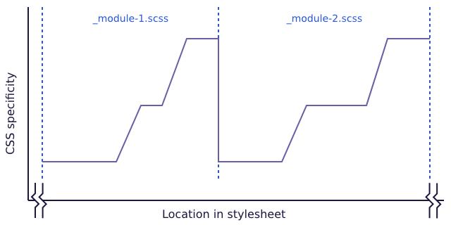
The important thing here is to keep the “upward trending” graph in mind. That means that inside of modules or components the trend can (and oftentimes also should) go upwards locally. This is for example the case if you are using a second class to a selector to generate some sort of context, or if you have to use element selectors because you are not in control of the markup output (e.g. because the output comes from a WYSIWYG editor). Orde Saunders puts this pretty nicely in the article CSS specificity graphs in practice (here in the context of developing with pre-processors):
What we’re aiming for in this case is for specificity to increase within each source file whilst still maintaining the overall trend for an increase in specificity. This means we’ll end up with saw teeth of specificity at the micro level:
Again: only the overall, global trend should stear towards an upward trending graph.
An important thing to keep in mind
Before starting to explore the Specificity Visualizer I want to emphasize something: specificity graphs are a conceptual model, and not an exact scientific tool (far from it, actually). So please always keep this in mind when using the visualizer:
- There is not the one way of interpreting specificity graphs that can tell you that a graph is 100 % “bad” or “good”. At the most you can identify patterns, trends, inconsistencies, and get an overall “feeling” of a code base.
- Don’t take specificity graphs too serious.
- Don’t judge other people’s CSS with it. A specificity graph doesn’t tell you much if you don’t know the context, the setting, and the constraints the code has been written in. It can only give you an indication that someone made a decision for this or that in a part of the code. These indications should make you ask questions, not judge.
Thanks a lot to Thierry Koblentz for having brought up these important reminders into the discussion!
Let’s get started
So let’s get started. What is the best way to play around with the Specificity Visualizer? You can paste some CSS code into it; either code you wrote, your company’s code, or browse to big sites, get their main CSS file, and see how they are doing. I will go through two examples with you: cnn.com and zeit.de to show how I read their specificity graphs.
cnn.com

Click on the image above and look at the graph for a while. What can you see there?
I spotted some things pretty quickly:
- Look along the
xaxis: we are talking about roughly 16.000 selectors, so this is a huge file (it’s about 38.000 lines of code when formatted nicely). - Look along the
yaxis: we have a lot of labels there, that means that a lot of different categories of specificity are in use. That indicates that the general level of noise or entropy is pretty high. There is a lot going on in terms of specificity, e.g. you have quite few selectors which have a specificity of0,6,0or higher (even0,10,0or higher). - Then there are the selectors per se to look at (the actual data or dots in the chart). We see immediately that all three types of specificity categories are in use (ID, class and element selectors) and how they are distributed over the entire file.
- One might ask why are there some global element selectors right in the middle bottom part of the chart? That seems quite strange.
- Also, there are quite large ranges of selectors that show a strange pattern: the selectors 2.400–3.100 and 9.700–15.400 are set at an unusual elevated plateau. Here you can ask the questions: What is the reason for this? Can this be optimized?
- What also catched my attention is the second accumulation of ID selectors at around 9.500. Underneath that accumulation you see a big gap in the usage of class selectors. Why is that? My instinctive thought was that someone tried to overwrite some class selectors with ID selectors. I zoomed into that area and it’s true: way down of the ID accumulation you have the selector
.pg-sponsor-article .owl-carousel .owl-nav .owl-prev(specificity of0,4,0) which gets overruled by the selector.pg-sponsor-article #bigPicture .owl-nav .owl-prev(specificity of1,3,0) and overrides declarations from the class selector.
I got all these insights from looking at the graph for a few minutes. Isn’t that amazing and empowering? We are talking about 38.000 lines of code and we could immediately spot potential issues and inconsistencies across the entire file within minutes, if we know what to look for. Which is a matter of training this approach.
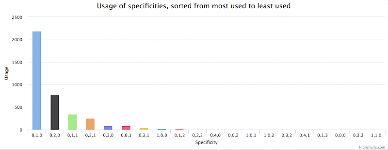
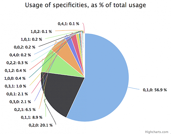
The amount of noise is also visible in two additional charts that are placed underneath the main specificity graph:
The column chart shows the total usage of every specificity category present in the stylesheet (sorted by most used to least used), the pie chart shows the percentage distribution of these usages. Looking at the pie chart you can see for example that over 50 % of all selectors have a specificity of 0,4,0 or more.
Let’s look at another website.
zeit.de

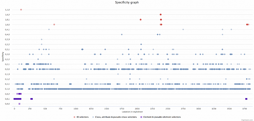
Again, click on the image above and look at the graph for a while. What can you see there?
Things that I spotted immediately:
- The graph looks a lot different compared to the graph above from cnn.com.
- The stylesheet is a lot smaller (around 4.000 selectors in total) than the one from cnn.com.
- The
yaxis shows a lot fewer labels, so a lower amount of specificity categories overall. - There are a few highly distinctive horizontal lines or “main streets”, namely the one on the
0,1,0and0,2,0level. This is an indication for some sort of consistent system or code pattern in use. - Let’s look a bit closer to these lanes. The
0,1,0lane means those are selectors consisting of only one class. The line above that (0,1,1), which has also quite few selectors on it, are mainly pseudo-element selectors which are attached to the appropriate class of a selector on the0,1,0line. It’s a gentle oscillation between two lines (e.g..feedback-section__headlineand.feedback-section__headline::before). The same can be observed between the lines0,1,0and0,2,0. Oftentimes selectors on the0,2,0are pseudo-class selectors attached to the appropriate class of a selector on the0,1,0line, again a gentle oscillation between two lines (e.g..search-text-input__inputand.search-text-input__input:focus).
Also in this case the amount of noise is visible in the two additional charts that are placed underneath the main specificity graph:
The pie chart reveals that around 57 % of all selectors consist of 0,1,0 and that around 20 % of selectors consist of 0,2,0. This indicates that we are talking about a well-structured, modular and namespaced CSS code base.
Recap
I hope that going through the two examples above helped you to understand what the Specificity Visualizer can do for you and what you can get out of the tool. To recap, here are things I like most about the tool:
- It’s a pretty fun and nice visual experience and potentially changes the way how you look into and think about stylesheets.
- You get a fast overview of what’s going on.
- You can hover over single data points to see the exact selector or zoom into areas of interest, e.g. you can look at only the selectors of the first half of the file or you can zoom into all selectors with the specificity of
0,2,1across the entire file. - You can quickly identify patterns and inconsistencies. You may also start asking the right questions and think about optimizations.
- You can communicate effectively to other stakeholders by taking screenshots of the chart and presenting them. It’s also a great way to track progress, e.g. you could save a snapshot of your stylesheet before and after a major refactoring to visualize the difference.
- It’s a good way of explaining the concept of CSS specificity across an entire file in a visual manner.
Next steps
I try to continuously improve the tool, so stay tuned for updates. One thing I want to add to the main chart is the distribution and usage of !important across the file. The keyword doesn’t affect specificity, but plays a major role in influencing the cascade. I think it would be a nice additional info to show (I already created an issue for it).
Please be sure to follow the project on Github. And, as always, any feedback is welcome. Reach out to me via Twitter or create an issue in the repository.
I also want to take the opportunity to thank everybody who reached out to me and gave me feedback already, and especially for sharing the tool with your communities to immediately bring awarness to it. I’m still quite blown away by the ample response this little tool unleashed. Thank you!


