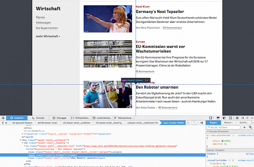
Sometimes one single hidden glyph in a HTML markup makes the difference between a good and an outstanding front-end. I recently had that insight after browsing through the HTML markup of zeit.de (which I do a lot after the phenomenal redesign). When you look at the heading structure of a teaser you notice two things:
- The heading is actually marked up as a heading (weirdly enough not common on big German news websites).
- Between the subheadline and the headline is a hidden colon.
The colon is surrounded by a span with a class that visually hides it. The gentle front-end developer recognizes immediately that HTML5 Boilerplate is being used here. In the respective documentation you read that this class hides content visually while still allowing assistive technologies like screen readers to process and read the content.
With this colon you affect the reading flow of the screen reader. It actually makes a pause after reading the subheadline before continuing reading the headline. Without the colon the screen reader would immediately and without a pause continue reading the headline, after reading the subheadline (which isn’t nice). Pauses inside of logically separated content blocks tremendously improve the reading and hearing comprehension and they are oftentimes crucial to actually understand the content like it was intended to be understood.
Going one step further
After tweeting my zeit.de discovery @botic replied to me with nice examples (#1, #2) of this technique which can be found on orf.at.
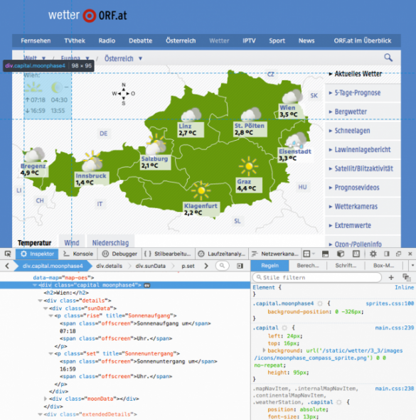
On the weather page you can see how the developers marked up information for sunrises and sunsets.
While you can visually see an arrow pointing up and down with the respective time of the day, what happens in the markup is that the times of the day are textually preceeded by a “Sunrise at” respectively “Sunset at”. This way screen reader users actually know what this is all about.
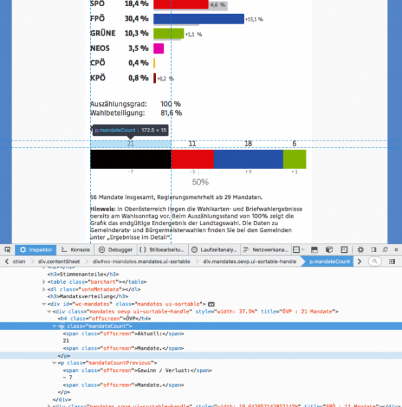
A further example is the display of election results in politics.
In the bar diagram you can visually see the number of mandates a party has above each colorized area, underneath are the gains/losses in respect to the previous election. In order to also get this working non-visually, what happens in the markup is that there’s placed the name of each party as well as contextual content like “Current:”, then the number of mandates, then “mandates” or “Gains / Losses”, then the percentage number, then “mandates”.
Expression of quality awareness
The examples listed above are remarkable to me because they demonstrate how you can immediately recognize the quality awareness and mindset of a front-end developer by means of tiny details (e.g. a hidden colon glyph). Not the visible is relevant, but – above all – the (supposedly) invisible. As a web developer you have to think in a holistic manner und you have to face the complete unknowingness about the devices of your website’s users with high-quality code which covers as many scenarios as possible. A website is only as beautiful as the underlying markup.


